Pros & Cons: Responsive Design vs Separate Website vs Dynamic Serving
Today’s internet users browse from all kinds of devices.
That could be great news for your business, but only if your website is well equipped for the multi-screen consumer.
Google wants you to make mobile-friendliness a development priority – it is, after all, a significant ranking signal.
Are you still struggling to reach every screen and offer your visitors a seamless experience?
Then you need to know your options, look at the pros and cons, and start building a great user experience.
Yes, you can!

Responsive Design vs Separate Mobile Site vs Dynamic Serving
Online marketers have claimed that mobile optimization is a must-have in terms of SEO best practices for years. Nevertheless, 21st of April 2015 marked an official change: Google released a new mobile-friendly ranking algorithm, specifically designed to boost mobile-friendly pages in its mobile search results.
You have 3 options to prep your website for this particular purpose:
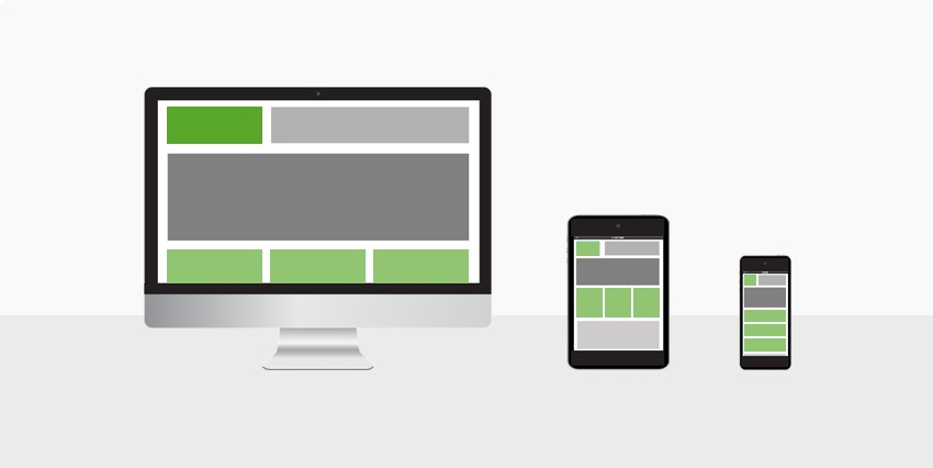
- Responsive design – one URL and one HTML code, content will adapt to the user’s device screen size;
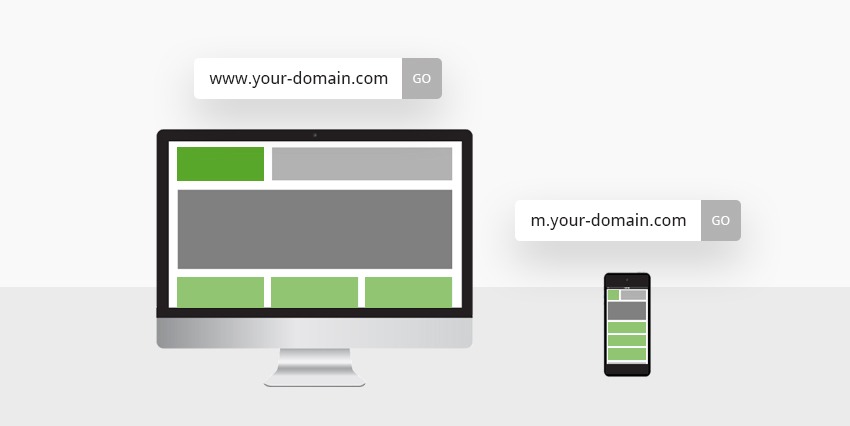
- Dedicated website – two URLs and separate HTML codes, server will redirect to the right website depending on the device used by the user;
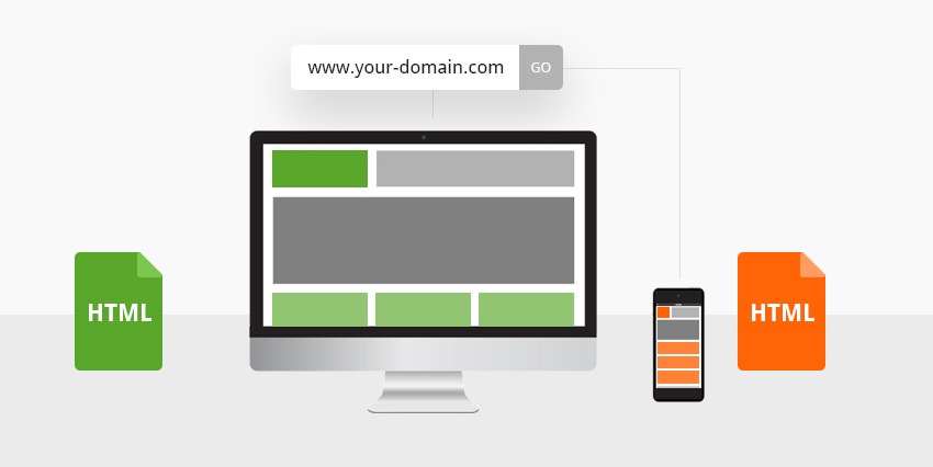
- Dynamic serving – one URL and separate HTML codes, content will show depending on the device used by the user.
Each of these options will help you have a mobile friendly website:
Responsive web design
Responsiveness implies that the browser will deliver the same HTML code, from the same URL address, regardless the device: desktop, laptop, tablet, mobile phone, non-visual browsers. All devices will give the same information, adjusted to fit the screen size, by following fluid grids and pre-defined break points!

The pros:
- Easier and cheaper to develop/promote;
- Easier to optimize for search engines;
- Easier accessibility, with no device detection/URL redirection necessary.
The cons:
- Longer load time for large pages;
- Less flexibility in terms of user experience;
- Higher risk of data bloating, making users download unnecessary information;
- Higher chances of failing in optimizing both the desktop and the mobile experience, if not carefully planned.
Dedicated website
With a dedicated website, you can host a mobile version of the same content, only on a different URL. One can use a mobile sub-domain (m.yourwebsite.com), a different domain (yourwebsite.mobi) or even a sub-folder (yourwebsite.com/mobile) with the same purpose.
This option implies user agent detection (client or server-side) to show which of the two URLs to display, depending on the user’s device.

The pros:
- Better user experience, the website being specifically optimized for mobile devices;
- Easier access, faster page load times-frames;
- Higher chances to rank better in local searches;
- More flexibility in terms of content, navigation options, writing length and style;
- No need to plan backward compatibility with the older desktop browsers.
The cons:
- Higher costs in terms of implementation, maintenance, and even marketing;
- More challenges with user redirecting and cross-linking between the two platforms;
- Still requiring responsiveness elements, since there are so many mobile devices, with different screen resolutions and sizes.
Dynamic serving
With dynamic serving, your website will use different HTML and CSS codes, from one user agent to another, through the same URL. Think of it as the perfect combo between responsive web design and a separate mobile website.

The pros:
- Perfectly customized user experience, with layouts designated to a range of devices;
- Easier to adjust, letting you interfere exclusively on one particular screen size, leaving everything else unchanged;
- Possibility to design all kinds of pages, for all kinds of devices, individually – from smartphones and tablets to smart TVs;
- Less confusion among your users, because of the single URL;
- No need for complicated annotations;
- Easier to optimize for search engines;
- Faster page load times.
The cons:
- Higher implementation costs;
- Must have a highly capable IT staff to manage all the code requirements and content updates.
Bottom line
Many people seem to believe that responsive web design is the only solution for mobile optimization. As it turns out, responsiveness alone is not your only option and definitely not your best option!
You can always try to make an extra step and add a dedicated mobile website or, even more advisable, use dynamic serving and offer your users the best possible mobile experience.
Still not sure where to start from?
Design19 can help you with anything from research and planning to UI/UX design, web development and even the online marketing that comes afterward.
We would love to chat and get to know your business better, then help you refine your business goals. Ultimately, we will help you with choosing the most appropriate option for your business and, most importantly, for your customers.
So tell us your biggest concern now, right here.