Accelerated Mobile Pages – Case Study
Building a great mobile website to load super fast and to give your users an amazing experience, is now possible by using AMP – Accelerated Mobile Pages, a technology developed by Google.
In this post, we will try to describe our experience with the AMP and we will help you to be more aware of the AMP code specificity. We will offer you the insights and the resources which we didn’t knew about when we started.
What should you know before building with AMP?
Below, I will describe you the technologies I used. All this will make your job a lot easier, although is not required to build an AMP website.
What is AMP ?
AMP or Accelerate Mobile Pages is a project build by Google designed specialy for mobile devices which makes websites load very fast, almost instantly. This makes user experience faster and better. Imagine you have a ecommerce website and you have a targeted audience from mobile devices, AMP technology is one of the keys which makes your users navigate your website with ease without leaving or waiting seconds for the page to load.
Remember!
Using AMP you will no longer can control your project with basic Javascript or other 3rd parties libraries like jQuery. You need to go back to the roots in your knowledge in building static html websites. Although you can be a “hacker” and use grunt, jekyll or ruby to output static html files which by default all amp developers strongly suggest.
Below are some links which will explain in more detail what is Accelerate Mobile Pages.
AMP Homepage
AMP Docs
Learn AMP by Example
CSS Building Philosophies
Before you begin building a website with AMP its very important to have some knowledge in one of CSS code writings philosophies like OOCSS, ACSS, BEM, SMACSS. You don’t need to know all of them. Start using one, and develop your skill on by one. I prefer using SMACSS. If you don’t know what to choose, I suggest you to try them out and stick with one who fits you most.
CSS Preprocessors
Using one of the CSS preprocessors like: SASS, LESS or Stylus it’s a must when you develop a large website. My recommendation is using SASS. If you don’t know which are the differences between them, I strongly suggest you to look over this article.
Task Runners
A Grunt or Gulp will do the job. I’m using Grunt in all my projects because I’m comfortable using it. Besides that, it has a lot of plugins and it’s well documented. This topic will include a whole chapter because the project is very dependent on front.
Static HTML generator
Building a large website only in HTML without using PHP, or JS libraries it’s a hard thing to maintain and debug, thats why i strongly suggest using Jekyll static site generator. Building with Jekyll will reduce the amount of HTML you have to write and will make your life easier when you start to debug. So before you begin, spend some time and explore the possibilities with jekyll. Another solution which I didn’t explore, but I thought about after I finished my project, is to use WordPress as CMS with this plugin WP Static HTML output. Although you must twitch WordPress html syntax output. If you have used this type of workflow in your project, please leave a comment, I’m curious about your experience.
Chapter 1 – Design vs Reality
Building my first AMP project was difficult. At the same time I think it could be done better. Because of that, I decided to describe you my struggles and mistakes, in the idea that you do not make the same mistakes as me.
When I received the design, my first impression was that it could be done easily, but the constraints which AMP brings in the normal workflow of a developer will make him test his own skills.
Navigation menu – Sidebar
On the left is the initial design, and on the right is the design that I made.
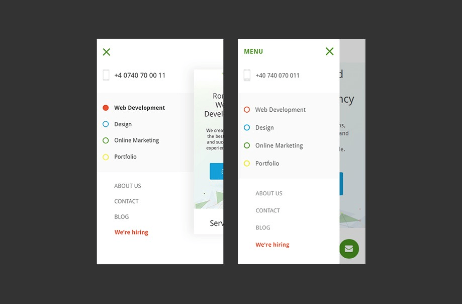
As I said before, the initial design was easy to do in a default environment with not so many constraints. When I started, I tried to create the navigation as well as in design with some checkboxes and CSS tricks. When I saw that I have too many errors I deleted all what I did, and I remained with the default sidebar which AMP has by default.
The amp-sidebar must be the direct child of the body tag. If you wrap the sidebar inside an HTML tag, you will receive a lot of errors.
The sidebar menu (by default) an active state, can slide from left to right and from right to left. The maximum width is between 45px and 80% of the viewport which you can customize with CSS.
So if you have a mad design and you try to make a cool navigation menu, just…. drop it! Why? Because you will waste too much time trying to go around AMP’s constraints. But if you like the challenges, you can do it.
PS: The hover and the click state, share almost the same functionality of the mobile devices.
Footer
Building the footer, was a challenge. Because I wasn’t familiar with AMP’s components, I didn’t know how to implement the design in an elegant way, with no errors.
Design
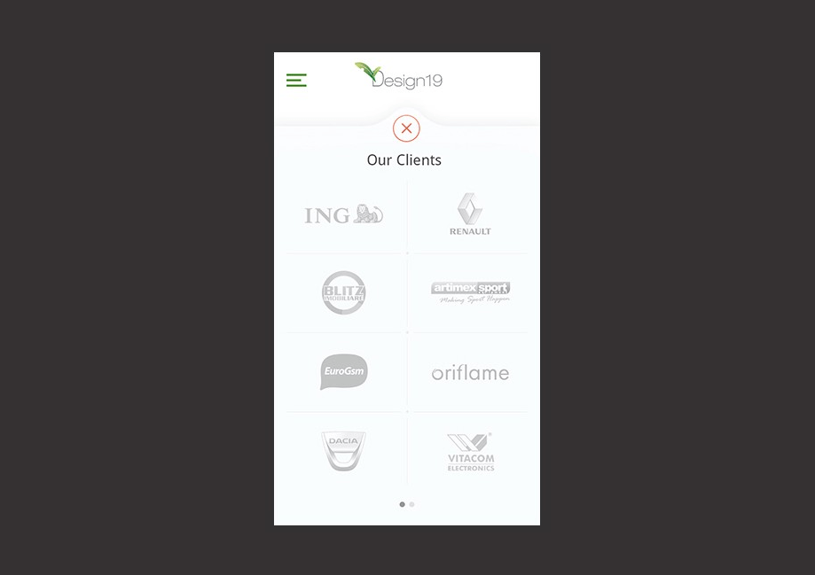
The carousel design of the“View our clients” section
An idea comes up in my mind when I was halfway to finish my AMP project. I could use a carousel inside an accordion using fixed sized images and flex-box display. And the result was almost the same.
Output
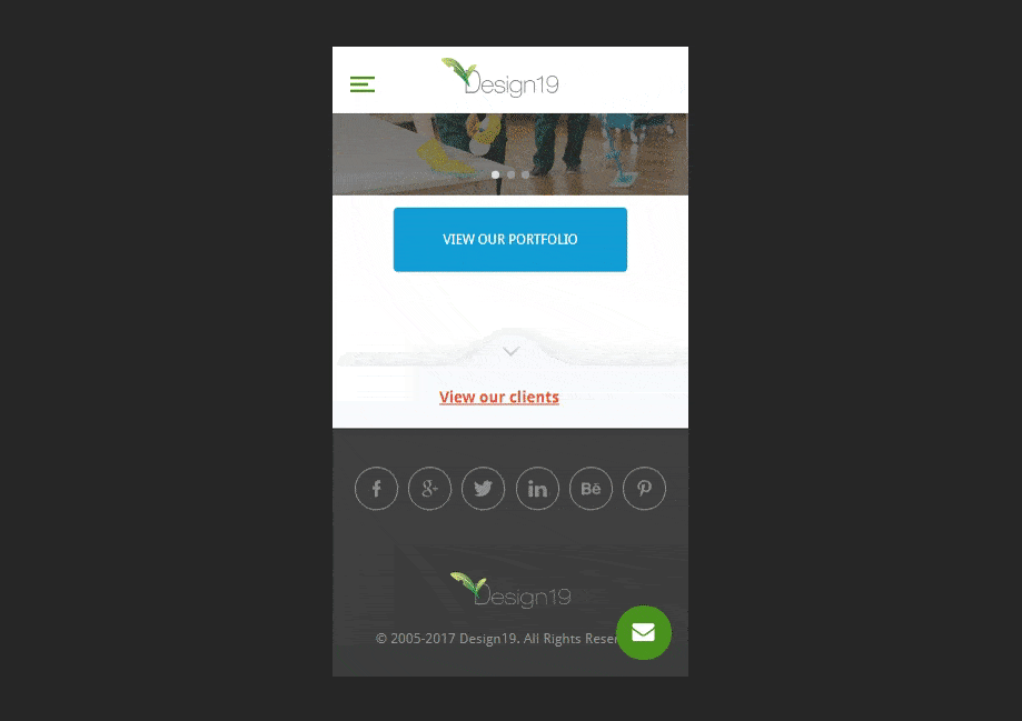
The carousel which slides up when you press on the button View our clients
The designer wanted the carousel to slide up when you press on the button View our clients. He wanted a nice animations, but this sort of animation is impossible to make without Javascript. So I had to build it to match at least with the design if I couldn’t with the animation.
The mission was to build a carousel with 8 images on a slide. I had to build 5 slides with 8 images/slide, where it resulted, a very large code, ~ 600 lines of HTML, just to match the design.
First, I had to build an accordion and inside this to add the carousel. Unfortunately, there are no such examples on AMP’s official website, so in most cases, if you have a complex design you must be somehow “creative”.
Forms
Building the forms is the ugliest part which I met. It’s easy to make the design of the inputs, but to make the design for success states and error states you must have a valid form which means you must build some code on your desktop website to tell the AMP forms it can connect to your desktop forms. We spend a whole day (me and a backend college), trying to make the forms work. There were a lot of steps to do on our desktop version of PHP.
Only if the forms are valid you can design the success states and error states, because if the forms are not valid you will not receive anything
Hover — Click Hack
I had a design which was similar to a navigation tab – AMP doesn’t have tab components.
Here is the design I had to made only with the CSS.
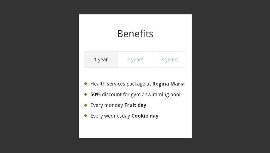
The “Benefits” section design
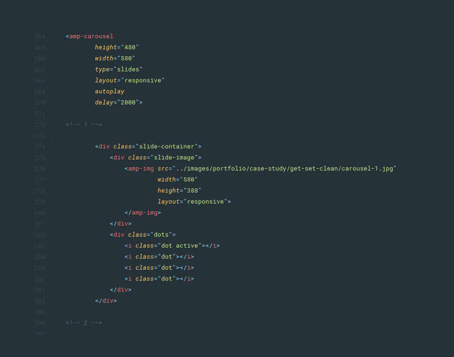
Carousel
Building a carousel is very simple with the AMP. In my example I will show you how you can build a carousel with dots and which will show you which slide is active and which is not.
The “Benefits” section deisgn – simulate the click function with the hover function
I have 4 slides. Therefore I must add manualy 4 dots and the current slide has a dot class followed by class active.
Here is the output.
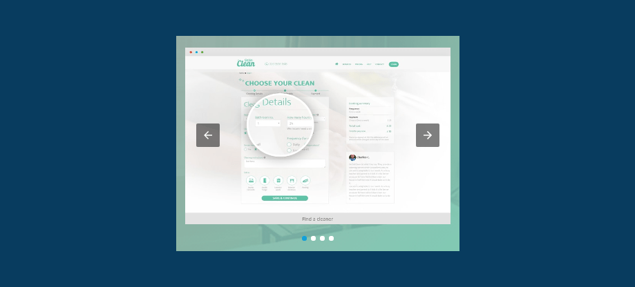
Output for the slides
AMP has specific tags in which I had to put the images, making the process of building the website slower because I had to be careful to check every image size, to reduce it if it’s bigger than 600px width, and if it use more disk space than it should normally do, I had to compress it. To not repeat my mistake and do this manually, go and find a grunt module that does this automatically for you.
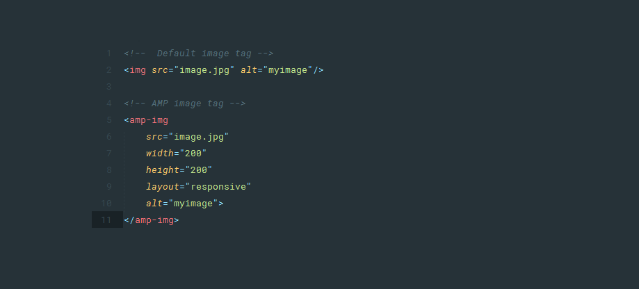
The AMP image tag
Why does AMP requires this specific tag ?
1. If we put height and width attributes inside the image tag, the browser no longer has to calculate what size of the image, it simply renders the height and width which you specify.
2. Layout: As you can see I put the layout, responsive, which means that the image by default will fill the container no matter the height. We can also put layout fixed which no longer will fill the container, will be a fixed img, no matter the size of the container.
3. AMP gives us a large variety of layout to put in images: fill, fixed, fixed-height, flex-item, nodisplay, responsive. Here I give you a link with more details on AMP img.
Other mentions
- Building an AMP website, with more than 90 pages, was difficult. Every day I discovered new things about how can I improve the website. What I discovered along the journey is that the limitation of AMP’s tech is only in the developer mind, you can do amazing things with it.
- If I had to build from the ground up again, I would do 10 times faster and 10 times better, I strongly suggest, if you are a front-end developer, building your first AMP website, is to read this whole article and if you have questions about it, leave a comment below.
- The probability the designer didn’t heard about AMP technology. My designer college didn’t know how the AMP works and what are his specifications. He did an amazing job, but some stuff I had to drop: animations, transitions, stuff that floats, all because I couldn’t use Javascript.
Chapter 2 – Project structure
From the start, build a folder skeleton for your website. My advice – don’t jump right into HTML and CSS. Take time to build your project structure, even if it’s small or big. This is a good practice to enable your mind projecting better decisions making for future development.
This is an example which is not built with Jekyll but it has almost the same folder structure like the one I had built, but for time sake I will reduce it to something simpler.
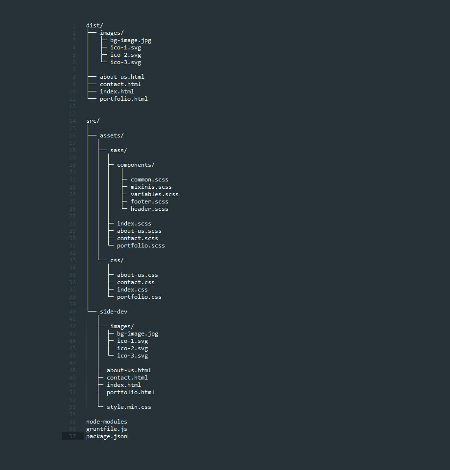
Project structure with AMP
As you can see in the folder structure we have style.min.css inside site-dev folder and we have all the specific CSS files in the folder assets/css/{specific-page}.css.
This is because we need the style.min.css to be direct sibling with the html file, because in the dist folder the style.min.css will be replaced by assets/css/{specific-page}.css.
Inside the html file, take a look at Chapter 3 part 4.Grunt HTML build
To avoid this situation I think this could be done in a more elegant way with Grunt Css Url Rewrite. Write a comment if you used it, it will be much appreciated.
Chapter 3 – The Grunt Modules

Grunt Task Runner – the module you need to install
To make most of our Grunt Task Runner we need to have some modules installed.
- Grunt SASS
This module will compile your SASS code in CSS code. - CSS Cssmin
This module will minify your CSS - Grunt Watch
This module will run grunt automatically when we save a SASS file from your text editor. - Grunt HTML Build
This module will automatically insert the inline CSS file, between <head></head> tags.
Input HTML
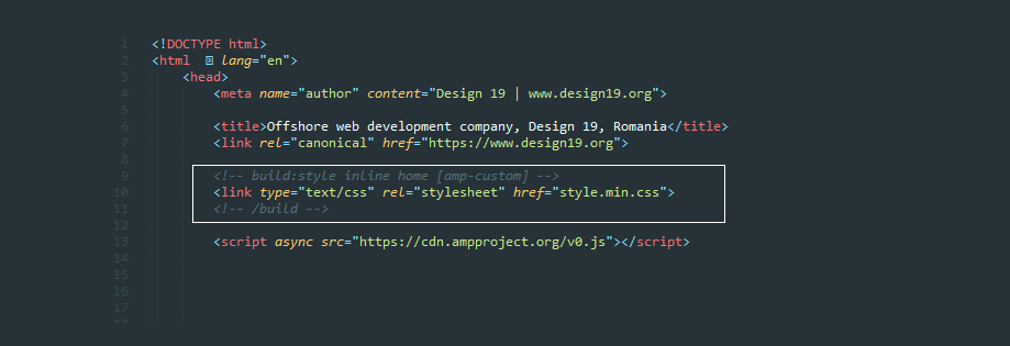
The style.min.css link – Imput HTML
In the link href, I have the style.min.css, in which are all the styles – this is only for development mode.
Grunt Settings
The style.min.css link – Imput HTML
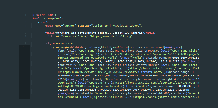
Output HTML
- Grunt HTML minifier
This module will minify the HTML files. - Grunt Gzip (optional)
This module will tell us how much space memory, will reduce for every file, if we compress the HTML files in .gz format. - Grunt Compress (optional)
This module will actually compress the HTML files and img files in .gz format. It’s a good practice to archive your HTML files because it will save approx. 80% of memory. Although you must tell your server to serve .gz format in order to make use of it.
Chapter 4 – Fonts
If you read the AMP documents you can add fonts with Google Fonts in head tag, or you can use font-face.
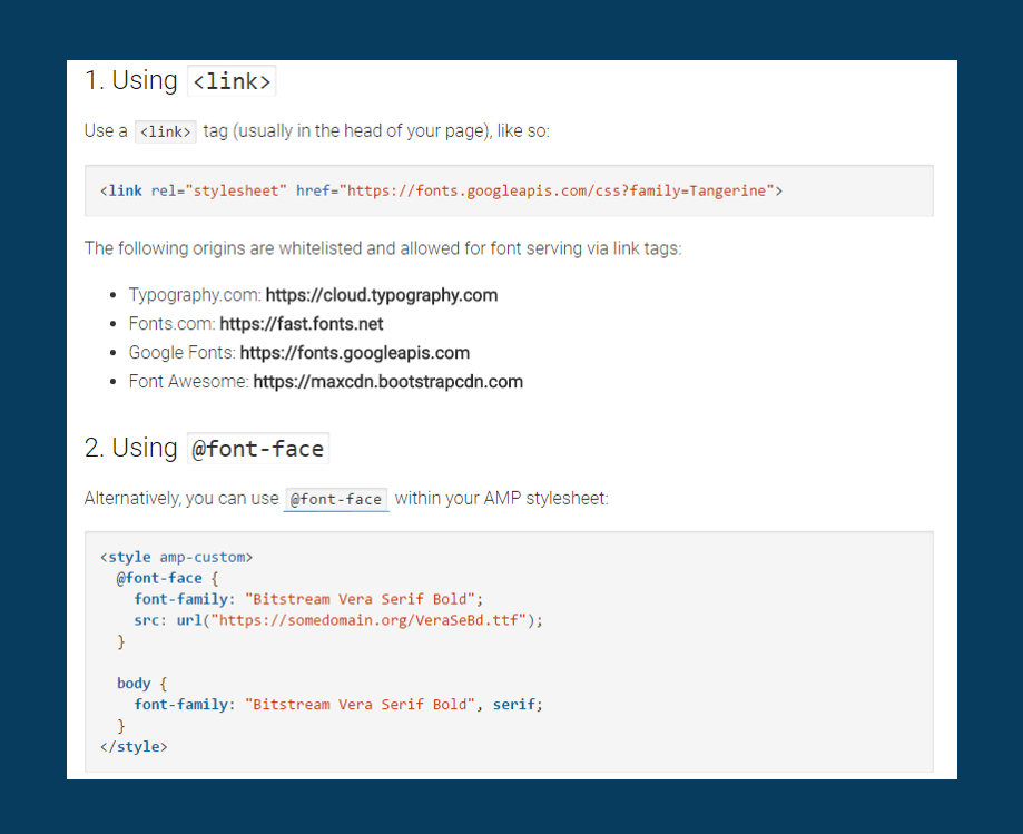
Add fonts usign tag or @font-face
If you add fonts using the <link> tag, your page will be scored lower by Google PageSpeed.
Add the fonts with Google Fonts in the head tag
To have a good pagespeed score, you can use Google Fonts. You can add Google Fonts in CSS with font-face. Otherwise the browser will not recognize italic/bold font style for your font family.
The method I used is:
googlefonts.com > select font > copy the link of the font starting with https > paste it in a new browser tab > copy the content in your SCSS file
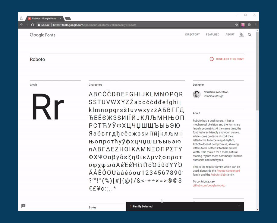
Add Google Fonts in CSS with font-face
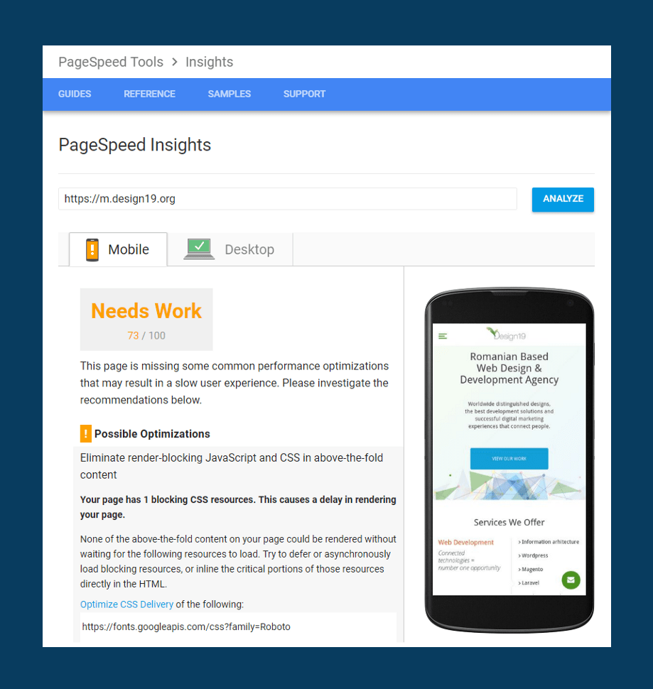
With this method your score on google page speed will dramatically increase (see the picture below).
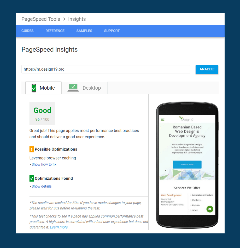
Pagespeed score after you added Google Fonts in CSS with font-face
Chapter 5 – Have fun with AMP!
Resources for advanced developers who want to build with AMP
Ruby on Rails + AMP
Jekyll + AMP
WordPress Plugin for AMP
Remember:
- Set the image size correctly
- You can’t use !important value in CSS
- You can’t style the default -amp propriety at all, so you must stick, in some situation, to the default design.
- Use SVG if possible
- Compress your images by using this site.
- Don’t use any frameworks like, bootstrap, foundation or any other framework.
- Build your own framework, you can be inspired by pure.css
- Take a look at normalize.css and copy only what you need.
- The CSS should not exceed 40kb.
- Learn the AMP syntax, it’s easy – you should learn the basics in 5 minutes.
- Learn Jekyll, very useful when you build a static and large websites.
- Learn to build your work environment.
- Chose a CSS philosophy (SMACSS, OOCSS, BEM)
- SASS ,GRUNT or GULP is a must for your sanity.
Chrome Tools: